To choose mood-enhancing hues for your home cinema, consider warm tones like terracotta and taupe to create a cozy, intimate feel, or cooler shades like muted blues and greens for calming focus. Darker walls can boost contrast and evoke a theater atmosphere, while lighter hues keep the space feeling open and distraction-free. Pairing these colors with appropriate lighting amplifies their mood effects. Keep exploring adjustments to design your perfect immersive environment.
Key Takeaways
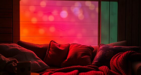
- Warm hues like terracotta and taupe create a cozy, inviting atmosphere that enhances comfort and intimacy during viewing.
- Cool colors such as muted greens and blues promote calmness, focus, and reduce visual fatigue for extended watching.
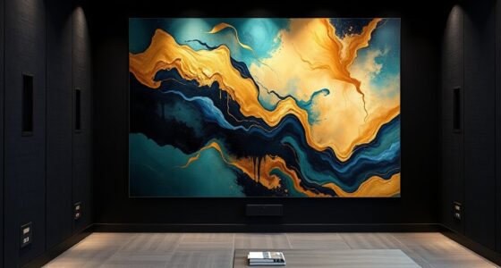
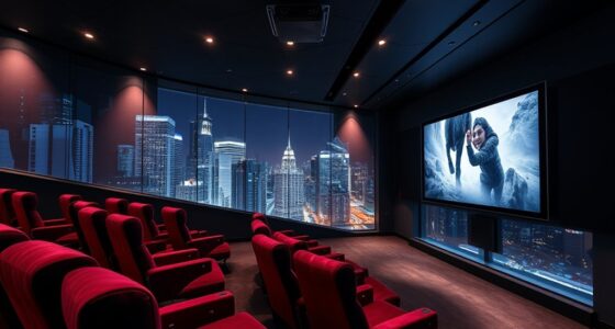
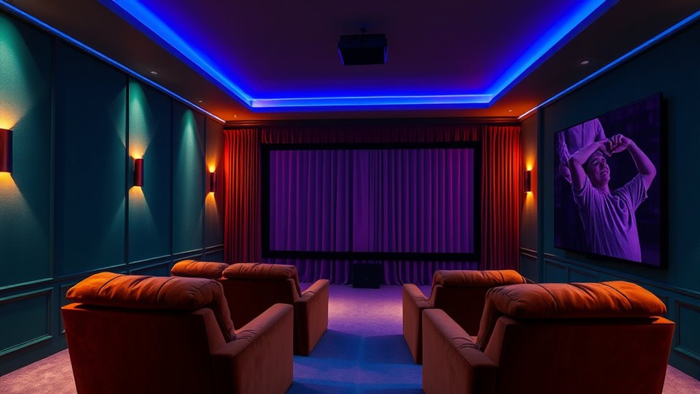
- Dark wall shades like deep blue or charcoal improve contrast and evoke a theater-like mood, heightening cinematic immersion.
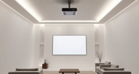
- Light, neutral tones provide a distraction-free background, making accent lighting and screen visuals stand out effectively.
- Combining color choices with adjustable lighting allows for customizable moods that enhance emotional engagement and overall experience.
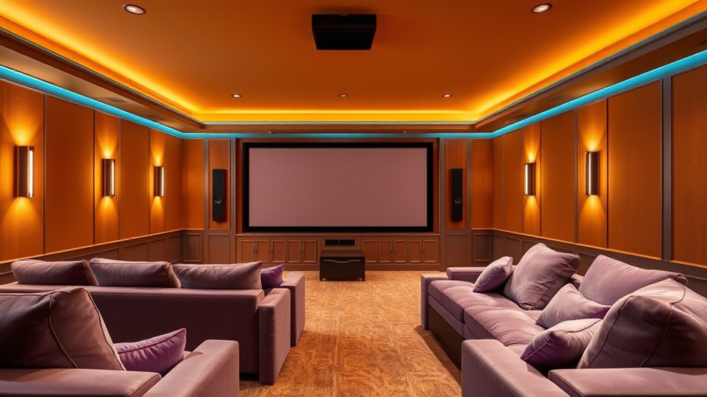
Color plays a powerful role in shaping your home cinema experience, influencing both mood and perception. When you consider creating the perfect environment, you need to pay attention to lighting techniques and wall colors because they work together to enhance or diminish your viewing pleasure. Lighting techniques are essential because they determine how colors are perceived and how much they impact your mood. For example, soft, dimmable lighting can create a cozy, immersive atmosphere, making dark wall colors even more effective at reducing glare and reflection. Conversely, strategic accent lighting can highlight specific areas or features, adding depth and visual interest without overwhelming the space. When choosing wall colors, think about how they interact with your lighting. Dark hues like deep blues or charcoal can make your screen pop and give a theater-like feel, especially when paired with well-planned lighting that minimizes reflections. Light, neutral shades such as beige or soft gray can also work well, providing a clean, distraction-free background that keeps your focus on the screen. These colors can make the room feel larger and more open, especially if you opt for brighter lighting options. If you want to boost the mood and create a more vibrant, energetic space, consider warm tones like terracotta or warm taupe. These hues evoke comfort and intimacy, especially when combined with warm-colored lighting. Alternatively, cooler colors like muted greens or blues can evoke calmness and focus, ideal for a more relaxed viewing environment. When selecting wall colors, picture how they’ll look under different lighting conditions; what appears inviting during the day might feel stark or dull at night. It’s worth experimenting with sample patches of paint and observing them at various times of day with different lighting setups. Keep in mind that your lighting techniques can be tailored to complement your chosen wall colors, so you’re not just stuck with a single look. Use dimmable fixtures or smart lighting systems to adjust the ambiance based on your mood or the type of content you’re watching. This flexibility lets you fine-tune your environment to maximize comfort and immersion. Additionally, understanding lighting techniques can help you optimize your space for different viewing scenarios. Ultimately, blending the right lighting techniques with carefully chosen wall colors allows you to craft a home cinema space that’s visually pleasing, mood-enhancing, and perfectly suited to your preferences. By paying attention to these details, you’ll create an environment where every movie feels just a little more special, and your viewing experience is as enjoyable as possible.
![[Built-in Apps/4K Support] Smart Outdoor Projector with WiFi and Bluetooth, Movie Projector, DoIby Audio with Dual Speaker, Auto Focus w/ YouTube&PrimeVideo Proyector, Upgrad P62 Pro](https://m.media-amazon.com/images/I/51yAGv8VI7L._SL500_.jpg)
[Built-in Apps/4K Support] Smart Outdoor Projector with WiFi and Bluetooth, Movie Projector, DoIby Audio with Dual Speaker, Auto Focus w/ YouTube&PrimeVideo Proyector, Upgrad P62 Pro
[Upgraded Classic – P62 Pro Movie Projector] Building on the reliability and low return rate of the classic...
As an affiliate, we earn on qualifying purchases.
Frequently Asked Questions
How Do Wall Colors Influence Movie-Watching Comfort?
Wall colors markedly influence your movie-watching comfort by affecting wall color psychology and your overall mood. Darker shades reduce glare and enhance contrast, creating a cozy atmosphere, while lighter hues brighten the space. Ambient lighting effects work with these colors to minimize eye strain and improve focus. You’ll find that choosing the right wall color and lighting setup makes your home cinema more immersive and enjoyable.
Can Color Choices Affect Sound Perception in Home Cinemas?
Color choices can influence sound perception in your home cinema by affecting sound wave interference and ambient light reflection. Darker, matte hues reduce ambient light reflection, preventing glare and distractions, while also minimizing sound wave interference that can distort audio clarity. Bright or glossy colors may reflect light and cause uneven sound distribution, diminishing your viewing experience. Selecting appropriate hues helps create an immersive environment with clearer audio and ideal visual comfort.
What Colors Are Best for Reducing Eye Strain During Long Viewing Sessions?
Stick to soft, muted colors like blues, greens, or warm neutrals for your walls and ambient lighting. These hues help reduce eye strain, minimize screen glare, and create a calming atmosphere during long viewing sessions. Keep your ambient lighting dim and indirect to prevent contrasts that tire your eyes. By choosing these colors and lighting techniques, you’ll enjoy more comfortable, immersive movie nights without the fatigue.
How Do Cultural Differences Impact Color Preference in Home Theaters?
Cultural differences considerably impact your color preferences in home theaters. You might favor specific hues due to cultural symbolism, such as red for luck in China or white for purity in Western cultures. Regional color preferences shape your choices, making your space more meaningful and comfortable. By understanding these influences, you can select colors that resonate personally and culturally, enhancing your viewing experience with a deeper emotional connection.
Are There Any Colors to Avoid for a Home Cinema Environment?
Avoid dark hues like black or deep brown in your home cinema, as they can absorb light and cause eye strain. Similarly, bright tones such as neon or overly vibrant colors can distract you and diminish the immersive experience. Instead, opt for muted or neutral shades that promote focus and comfort. These choices help create a cozy, distraction-free environment, enhancing your overall movie-watching pleasure without overwhelming your senses.

4K Projector with Built-in Apps, 1500ANSI Auto Focus&6D Keystone Dolby Audio Kogata Smart Projector with WiFi 6 Bluetooth Outdoor Movie Proyector for Home Theater HDR10+ UPGRADE
【UPGRADE Version】Unlimited Streaming –Compatible with Netflix & Dolby Audio& DTS Audio: The Kogata GC357 home projector comes with...
As an affiliate, we earn on qualifying purchases.
Conclusion
Just as a painter chooses hues to evoke emotion, your color choices set the mood for your home cinema. Remember, the right shades can transform your space into a sanctuary of relaxation or excitement, much like a guiding star in the night sky. By thoughtfully selecting your hues, you craft an environment that nourishes your soul and elevates every viewing experience. In the end, your colors become the silent storytellers of your personal cinematic adventure.
HAPPRUN Native 1080P Projector, Bluetooth Home Theater Movie Projector with Built-in Speaker, Compatible with Smartphone, HDMI, Fire Stick, PS5, Indoor & Outdoor Use - Without Google TV System
[ Native 1080P Full HD Resolution ] - Enjoy crystal-clear visuals with HAPPRUN H1's native 1920x1080 resolution, delivering...
As an affiliate, we earn on qualifying purchases.
![[Officially-Licensed App & Auto Focus]White Smart Mini Projector with WiFi and Bluetooth, XuanPad 4K Support Movie Projector, Portable Native 1080P Outdoor Projector with 360° Stand](https://m.media-amazon.com/images/I/51I8uy-U8bL._SL500_.jpg)
[Officially-Licensed App & Auto Focus]White Smart Mini Projector with WiFi and Bluetooth, XuanPad 4K Support Movie Projector, Portable Native 1080P Outdoor Projector with 360° Stand
Exciting Moments Begin - The XuanPad mini projector compatible with Netflix for the ultimate viewing experience.No extra devices...
As an affiliate, we earn on qualifying purchases.