
Get your home office setup delivered free — and shop member deals
- Fast, free delivery on millions of items
- Access to Prime Big Deal Days deals on October 6–7
- Prime Video, Amazon Music and more included
A race garage, rebuilt as an interactive room
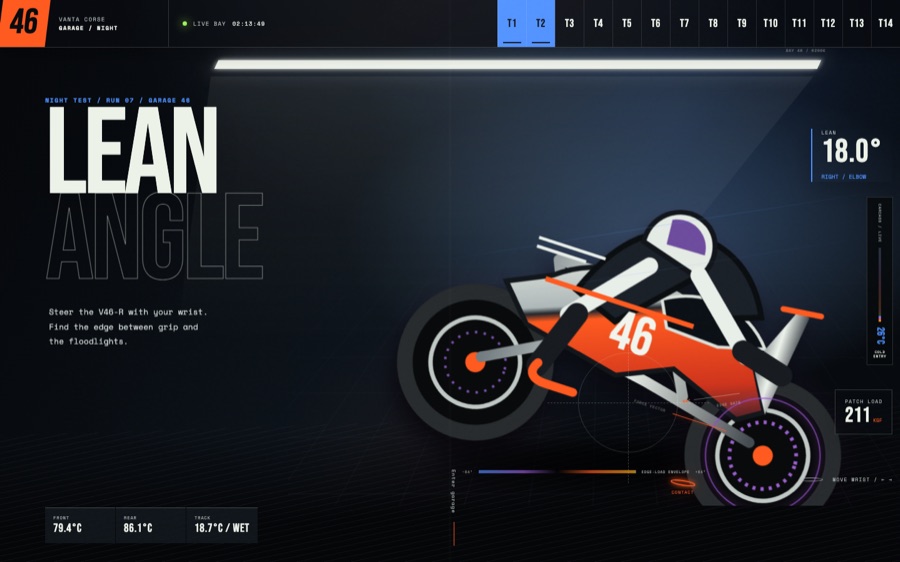
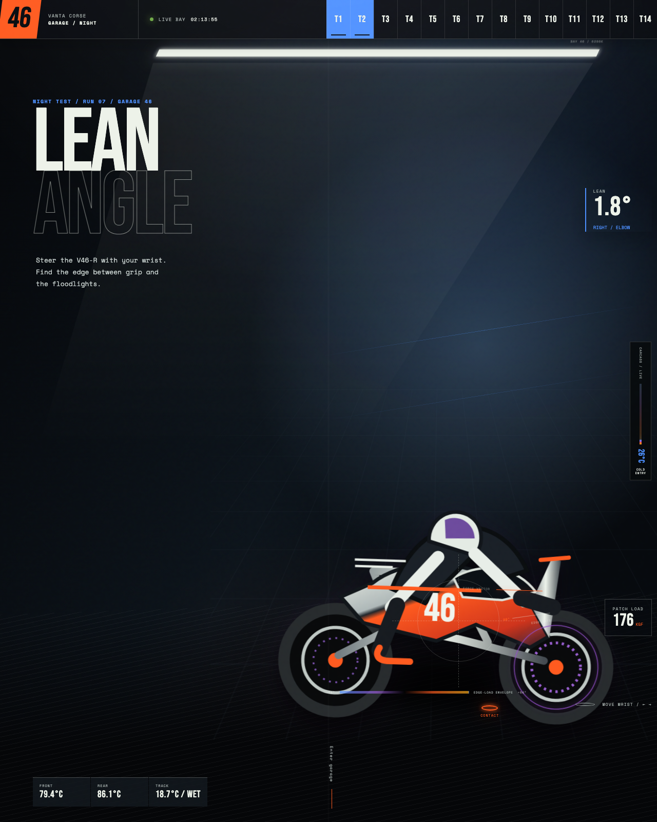
Garage 46 is an AI-built exhibition piece: a fictional motorcycle-racing team’s night setup, staged as a web environment rather than a real company website. Its scene is a wet paddock at 02:13, between test runs. Instead of treating the garage as a backdrop, the design makes it the organizing idea: corner numbers become navigation, setup records become chapter labels, and the final section suggests a garage door lifting at the end of the visit.
The room’s defining move is to let the visitor lean the motorcycle. Move a pointer across the central stage, drag on the bike, or use the arrow keys, and the illustrated machine tilts in response. Its contact patch, shadow, and load readout shift with the angle. That single interaction gives the page a sense of physical presence, like adjusting a machine at a workbench rather than scrolling through a team brochure.
From cold inspection to quiet debrief
The experience follows a deliberate temperature curve. It opens with cool, technical restraint, moves toward warmer and more tactile detail, then settles into the clarity of a post-run debrief. The result feels less like a conventional motorsport landing page and more like entering a carefully composed media room: focused lighting, specialized controls, and a clear sequence of zones.
What makes the room feel engineered
The visual system is built from code rather than photography. The motorcycle is inline SVG; CSS creates the fluorescent light, paper, tape, asphalt, metal, and grain; JavaScript supplies the responsive movement. That choice keeps the scene visually unified: the bike and its surroundings behave like parts of one designed interface, rather than separate images assembled into a layout.
The palette is tightly controlled. Near-black asphalt gives the page its depth, fluorescent off-white provides the sharp working light, and signal orange marks moments of heat and attention. Violet acts as a bridge between the cold-blue opening and the warmer later chapters. As visitors dwell in different sections, the page’s local color state changes, and a fixed thermal rail makes that progression visible instead of concealing it as decorative mood.
Typography reinforces the split between motion and measurement. A condensed display face handles compressed headings and lap-style numbers; a monospaced face carries notes, labels, and technical readings. The contrast suggests two familiar garage surfaces: bold markings on equipment and precise information on a setup sheet.
A responsive contact patch, not a decorative tilt
The lean interaction is the signature technique because it connects gesture to a believable mechanical consequence. Horizontal pointer position sets a target angle, limited to 64 degrees in either direction. A damped spring eases the SVG motorcycle toward that target and pivots it around its lower contact point. At the same time, several CSS properties reshape and move the contact ellipse, shift the shadow, and rotate the patch beneath the tires. A nonlinear edge-load calculation updates the displayed load as the lean increases.
At a high lean threshold, the page records the peak, holds the contact shape, and shows a brake-disc afterglow mark. This turns a numerical limit into a small visual event. Keyboard arrows use the same model as pointer input, while reduced-motion settings remove the inertial travel. The animation loop also rests when the page is hidden or when motion has settled—details that make the interaction feel considered, not merely lively.
Elsewhere, the setup bench translates accessible range controls into oversized clicker-like tracks. Changing compression and rebound updates setup outcomes, dial positions, and an exit-line illustration. A transcript noise switch offers a simpler reading of the crew’s decision. These elements extend the garage metaphor while keeping the controls understandable.
How the build came together
The production followed a three-pass pipeline: build the code-only motorsport environment around one physically meaningful input, critique it mercilessly across layout, legibility, interaction, and accessibility, then certify the result through an art-director review. The accompanying guide documents the core mechanics and materials, including the lean model, thermal chapter states, keyboard parity, reduced-motion behavior, and the choice to suspend animation in hidden tabs.
The full build notes live in the room’s design guide.
Want this? Paste this into your AI coding agent
Build a single-page showcase website from this art-direction brief. Work like an elite creative frontend engineer; commit totally to the direction.
BRIEF (room 132 of 175, “paddock”):
PADDOCK — GARAGE 46, temporada nocturna: a motorcycle grand-prix garage at 2am (fictional team). Aesthetic: fluorescent workbench night; tire warmers and torque wrenches. Palette: garage fluorescent white, tire-warmer orange, brake-disc glow violet, wet asphalt. Fonts: bebas-neue (display), space-mono (setup sheets). SIGNATURE: LEAN ANGLE — the hero bike leans with your cursor up to 64°, elbow-down, its tire contact patch visualized as a migrating ellipse with load numbers; the nav is a corner sequence (T1–T14, each named). Sections warm from cold-tire blue to operating-window amber as you dwell (tire-temp palette logic). Torn-tape setup sheets with mechanic marginalia, a suspension-clicker interactive (compression/rebound and the corner-exit consequence), the 2am debrief transcript. Unforgettable: steering the whole hero with your wrist.STACK: pure HTML/CSS/JS, no build step, no frameworks, no CDNs or external requests of any kind; self-hosted fonts only; every visual is code (CSS/SVG/canvas/WebGL) — no image assets required.
QUALITY BAR: flawless at 390px, 834px and 1440px with zero horizontal overflow; tap targets >= 44px; semantic landmarks, focus-visible styles, body-text contrast >= 4.5:1; prefers-reduced-motion pauses or simplifies heavy animation; rAF loops pause when the tab is hidden; hold 60fps (cap particle counts, avoid layout thrash); rich invented content everywhere — real-sounding names, numbers and program notes, never lorem ipsum; orchestrate one beautiful staggered load moment plus scroll and hover surprises. FORBIDDEN: Inter/Roboto/Arial/system-ui, purple-gradient-on-white, and cookie-cutter hero+cards+footer layouts.
PROCESS: iterate in three documented passes — (1) build plus builder self-critique, (2) merciless external critique finding and fixing at least ten real problems, (3) art-director elevation from good to unforgettable. Screenshot at all three widths every pass and fix everything you can see.
— Original brief by Claude Fable 5 (art director), executed by the FABLE/175 pipeline.
— This room lives at https://fable-25-830.netlify.app/sites/paddock/
This is the verbatim art-direction brief that produced the room — exposed by the exhibition itself via the “Prompt” link in the room’s footer.
Step inside Garage 46
Visit the live Garage 46 room to try the lean interaction and move through its night-setup chapters. It is an AI-built exhibition piece, and its racing team and garage are fictional—not a real company or paddock.
Then browse the hub’s collection of all 175 rooms for more experiments in digital spaces, visual systems, and interactive design.
Visit the live room → · Browse all 175 rooms
Previously in Wing VI
- Room 127: Meridian 843 | The Measured Mile
- Room 131: Project Icarus | The Ardent Line
- Room 129: KIRIN EXPRESS | 603 km/h above the guideway
FABLE / 175 is a finished exhibition of 175 fundamentally different websites, each built end-to-end by an AI. This article is part of our series walking through it room by room.
Halloween Picks
halloween
As an affiliate, we earn on qualifying purchases.