To fine-tune saturation and hue, you’ll want to make small, precise adjustments to enhance your image’s colors without overdoing it. Slight saturation boosts can make colors pop, while gentle hue shifts can correct color casts or create specific moods. Always preview your edits to avoid unnatural results. Mastering these tweaks helps you craft the perfect atmosphere and visual impact. Keep exploring these techniques, and you’ll discover even more ways to elevate your editing skills.
Make small, incremental adjustments to saturation and hue for natural and effective results.
Preview changes frequently to avoid unnatural color shifts or oversaturation.
Use precise tools and sliders to control the intensity of color adjustments accurately.
Balance vibrancy and mood to enhance the overall composition and emotional tone.
Understand how hue shifts can correct color casts or create specific stylistic effects.
Adjusting saturation and hue allows you to refine the colors in your images with precision. When you manipulate these settings, you’re fundamentally controlling how vivid or muted the colors appear and how they are positioned within the color spectrum. This process plays a vital role in enhancing color vibrancy, making your photos pop and grabbing viewers’ attention. By fine-tuning these elements, you can also influence the mood of your image. For example, boosting saturation can create a lively, energetic feel, while dialing it back can evoke a calmer, more subdued atmosphere. Similarly, shifting hue subtly can change the emotional tone—making a sunset warmer or cooler, transforming a daytime scene into a more nostalgic or dramatic one.
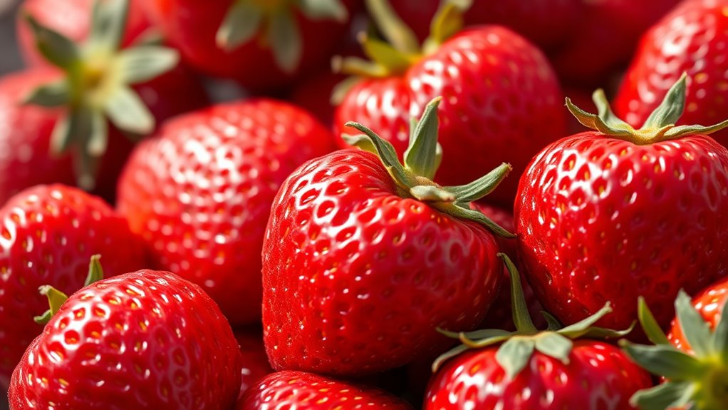
You’ll find that adjusting saturation is a powerful way to emphasize certain colors or tone down others. If your image looks dull or washed out, increasing saturation can breathe life into it, creating a more striking visual impact. Conversely, if the colors are overly intense and distract from the main subject, reducing saturation helps achieve a more balanced, sophisticated look. This control over color vibrancy allows you to tailor the mood precisely to match your creative intent, whether it’s making a product image more appealing or setting a specific emotional tone for a landscape.
Adjusting saturation enhances or subdued colors, balancing visual impact and mood in your images.
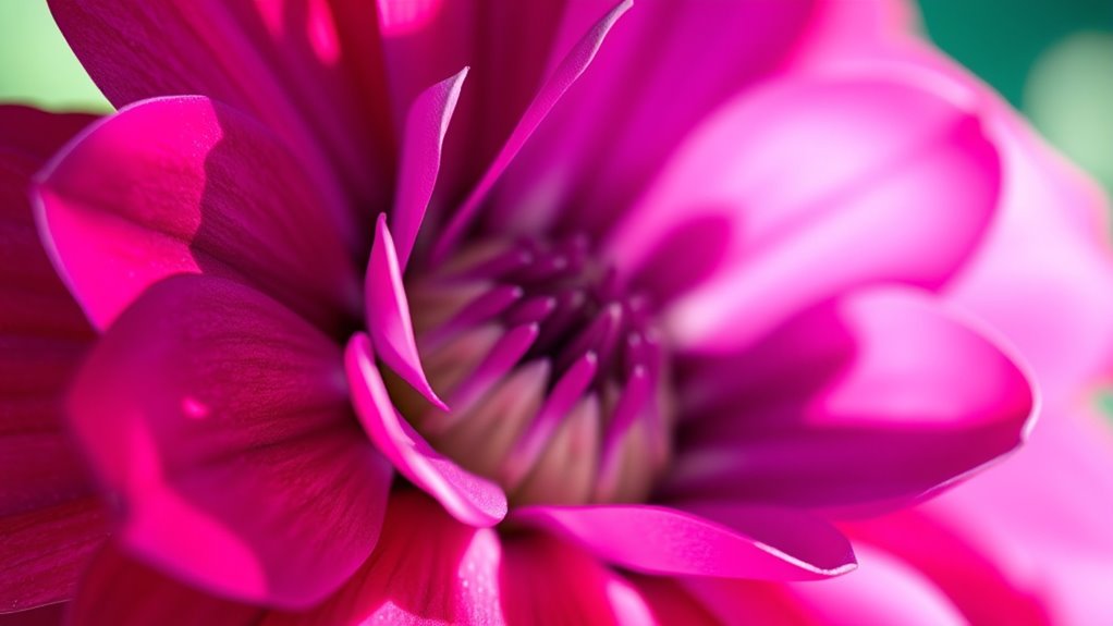
When working with hue, you’re shifting the actual color itself. For instance, a slight change can turn a green foliage into a more bluish tone or make an orange sunset appear more fiery or pastel-like. This subtle tweak can dramatically alter the overall aesthetic and emotional feel of your photo. It’s a useful tool for correcting color casts or creating a specific visual style. For example, shifting hue towards cooler tones may evoke calmness or serenity, while warmer hues can generate a sense of warmth and intimacy. These adjustments help you craft an atmosphere that resonates with your intended message or artistic vision.
Keep in mind that small, incremental changes often produce the best results. Overdoing saturation can make images look unnatural or garish, while excessive hue shifts might distort the scene’s realism. The key is to experiment carefully, preview your edits, and confirm your adjustments enhance the overall composition without overpowering it. By mastering the art of fine-tuning saturation and hue, you gain the ability to craft images that not only look visually stunning but also evoke the exact mood you want to convey. Additionally, understanding the importance of image editing tools can help you achieve these precise adjustments more efficiently.
Projector with 5G WiFi and Bluetooth, Native 1080P Projector[Projector Screen Included], Full HD 18000LM Movie Projector, 100" Display Home Theater, Compatible with Phone/Laptop/TV Stick
【2.4G/5G Dual-Band Wifi & Bluetooth Connection】 Roconia projector supports screen mirroring on iOS, Android and Windows devices without...
As an affiliate, we earn on qualifying purchases.
Frequently Asked Questions
How Does Saturation Affect Perceived Image Quality?
Saturation directly impacts how vibrant and lively an image appears, affecting perceived image quality. When you increase saturation, colors become more intense, boosting image vibrancy and enhancing color contrast. Conversely, lowering saturation dulls the image, making it look washed out and less appealing. By adjusting saturation carefully, you can create a balanced image that captures attention and maintains a natural, high-quality appearance.
What Are Common Mistakes When Adjusting Hue?
When adjusting hue, you often make mistakes like over-shifting on the color wheel, which causes unnatural skin tones or color clashes. You might also ignore subtle hue shifts that can improve the overall look. Always keep an eye on the color wheel, making small adjustments to avoid dramatic hue shifts. This helps maintain natural colors and prevents your image from looking overly manipulated or unbalanced.
Can Fine-Tuning Saturation Improve Color Grading?
Yes, fine-tuning saturation can markedly improve your color grading. It allows you to emphasize or subdue specific colors, enhancing your artistic expression and aligning with your intended mood. By carefully adjusting saturation, you tap into color psychology, influencing viewers’ emotions and perceptions. Mastering this skill helps you create visually compelling scenes that effectively communicate your story’s tone, making your work more impactful and polished.
How Do Different Color Spaces Impact Saturation Adjustments?
Did you know that choosing the right color space can boost saturation adjustments by up to 30%? Your color space selection greatly impacts how you modify saturation because of gamut limitations. Some spaces, like Adobe RGB, offer a broader gamut, allowing richer colors, while others, like sRGB, are more limited. Understanding these differences helps you avoid color clipping and ensures vibrant, accurate results during saturation tweaks.
What Tools Are Best for Precise Hue Correction?
You should use dedicated hue correction tools like Adobe Lightroom’s HSL panel or DaVinci Resolve’s color wheels for precise adjustments. These tools allow you to control hue shifts with high accuracy, maintaining color management and ensuring visual consistency across your project. By focusing on these features, you can fine-tune colors without affecting saturation, achieving professional results with consistent, balanced hues throughout your work.
GooDee Video Projector With Wifi And Bluetooth, Smart Portable Projector Movie System Compatible With Netflix/Dolby Audio/Auto Focus & Keystone, 4k Video Decode & 1080p Native For Home Theater/Outdoor
「Smart TV Projector」The Goodee AC321 4K projector is officially licensed by mainstream streaming platforms such as Netflix/YouTube/Prime Video,...
As an affiliate, we earn on qualifying purchases.
Conclusion
Now, with your newfound control, you can paint your images with the vividness of a sunset or the subtlety of dawn. Adjusting saturation and hue is like wielding a magic brush—bringing dull scenes to life or creating tranquil, muted landscapes. Feel the thrill as colors dance and blend under your fingertips, transforming your photos into mesmerizing works of art. Embrace this power, and let your creative vision burst into a symphony of stunning hues.
Epson Home Cinema 980 3-Chip 3LCD 1080p Projector 4,000 Lumens Color and White Brightness, Streaming/Gaming/ Media Room, Built-In Speaker, Auto Picture Skew, 16000:1 Contrast, 2 HDMI Ports
Exceptional Picture Quality — Provides stunning, detailed 1080p images and fast data processing that’s optimized for fast-action sports,...
As an affiliate, we earn on qualifying purchases.
Official Licensed Google TV Smart Projector, HAPPRUN 4K UHD Home Theater with Dolby Sound, Wi-Fi & Bluetooth, Built-in Streaming Apps, Compatible with Games Consoles & Smartphone, Indoor & Outdoor Use
[ Built-in Official Licensed Google TV ] - Without additional equipment, the smart projector can directly access Netflix,...
Understanding HDR and brightness mapping unlocks the full potential of your display, revealing how these processes enhance image quality and why calibration matters.

![Projector with 5G WiFi and Bluetooth, Native 1080P Projector[Projector Screen Included], Full HD 18000LM Movie Projector, 100" Display Home Theater, Compatible with Phone/Laptop/TV Stick](https://m.media-amazon.com/images/I/51tJ+dTl5qL._SL500_.jpg)


")