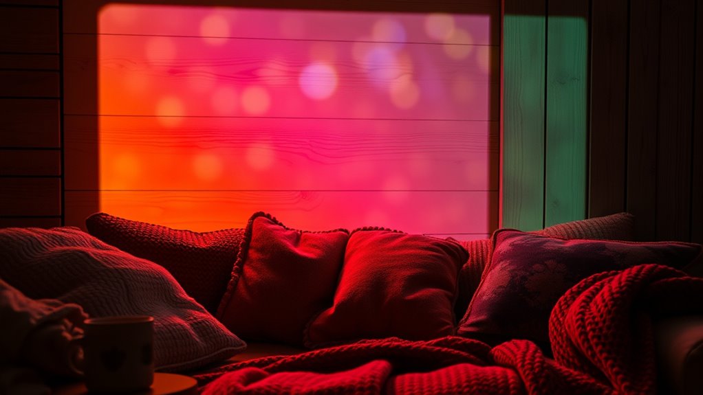

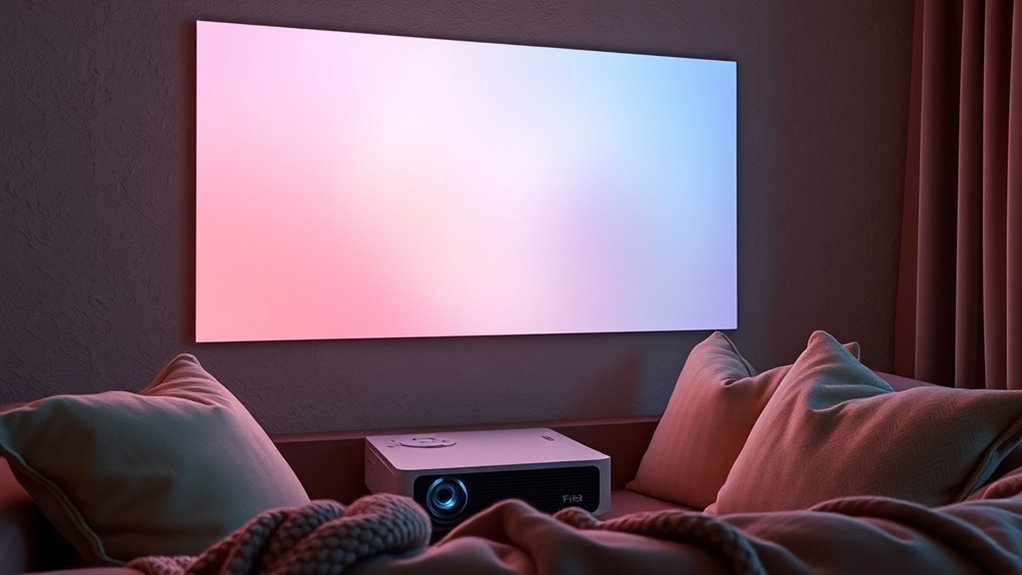
For cozy projector viewing, choose warm, soft color palettes like muted reds, gentle browns, and pastel shades that create an inviting atmosphere. Pair these with proper ambient lighting, such as dimmed warm lamps, to enhance color richness and reduce glare. Don’t forget, fine-tuning your screen calibration will guarantee these hues look vibrant and true to life. Keep exploring, and you’ll discover how the right mix of colors and setup can transform your space into a relaxing retreat.
Key Takeaways
- Use warm, muted hues like soft browns, gentle reds, and pastel yellows to create a cozy, inviting atmosphere.
- Opt for a color palette with harmonious earth tones that complement warm ambient lighting.
- Calibrate the projector to accurately display warm tones and prevent color washout in controlled lighting.
- Adjust room lighting to softer, warmer ambient sources to enhance the depth and richness of warm colors.
- Consider room size and layout to select calming hues that work well with ambient lighting and calibration for maximum comfort.
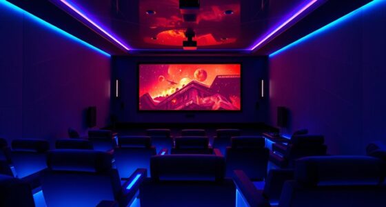
Have you ever wondered how to choose the perfect color palette for your projector? It’s a common question, especially if you want a cozy viewing experience that feels warm and inviting. The key factors you need to consider are ambient lighting and screen calibration, both of which influence how colors appear on your screen. Ambient lighting, the light present in your room, can dramatically affect how vibrant or dull your projected image looks. Bright lights can wash out colors, making your scene look faded, while dim or controlled lighting helps preserve the richness of your chosen palette. To create a cozy atmosphere, aim for soft, warm ambient lighting — think warm lamps or dimmed ceiling lights — which complements warmer color palettes and prevents glare or reflections that distort colors.
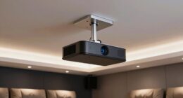
Creating a cozy projector setup involves warm lighting and careful color calibration.
Screen calibration is equally critical. It involves adjusting your projector’s settings so that colors display as accurately as possible. If your projector isn’t calibrated properly, even the best color palette can look off or unbalanced, ruining the cozy vibe you’re aiming for. Calibration ensures that the whites are true white, blacks are deep enough to add contrast, and colors are rendered accurately across the spectrum. When you calibrate your screen, you’re fine-tuning the projector’s contrast, brightness, hue, and saturation controls to match your room’s lighting conditions. This step guarantees that the warm hues you select — like gentle browns, muted reds, or soft yellows — appear soft and inviting, rather than harsh or overly saturated. Proper screen calibration can also help mitigate issues caused by ambient lighting, ensuring consistent color reproduction.
Choosing a color palette that promotes coziness also means thinking about color harmony. Soft earth tones, pastel shades, and muted hues tend to create a soothing environment. When combined with proper ambient lighting and precise screen calibration, these colors enhance the overall atmosphere, making your space feel more intimate and comfortable. Keep in mind that the room’s size and layout influence how you should set up your projector. Smaller rooms benefit from lower brightness settings and warmer palettes, which prevent the space from feeling cold or clinical. Calibration tools or professional help can make a big difference in achieving the perfect balance, ensuring your cozy viewing experience is both visually appealing and comfortable.
In the end, selecting the right color palette isn’t just about picking pretty colors — it’s about creating a harmonious environment where ambient lighting and screen calibration work together. When you pay attention to these details, your projector can transform your space into a warm, inviting retreat perfect for relaxing movie nights or quiet evenings.

2000 ANSI 4K Decoding Projector with WiFi and Bluetooth, HAPPRUN Movie Home Theater with Auto Focus, 300'' Display for Indoor/Outdoor, Smart Proyector Compatible with Phone/TV Stick/PC/PS5
[EASIER OPERATION: AI Smart Screen Adjustment] HAPPRUN projector comes with auto focus and 6D auto-keystone technology, enjoy a...
As an affiliate, we earn on qualifying purchases.
Frequently Asked Questions
How Do Ambient Lighting Conditions Affect Projector Color Choices?
Ambient lighting considerably affects your projector color choices because it influences color perception. In brighter rooms, opt for bolder, more saturated colors to stand out against the ambient light. Dimmer environments allow softer, warmer tones to create a cozy atmosphere. You should consider how ambient light interacts with your projected colors to guarantee they appear vibrant and true to your desired mood, enhancing your overall viewing experience.
Can Projector Color Palettes Be Customized for Individual Preferences?
Yes, you can customize projector color palettes to suit your preferences. You’ll find options for personalized color calibration, allowing you to fine-tune colors for ideal comfort and style. Plus, many projectors feature user interface customization, making it easy to select or create palettes that match your mood or decor. This way, you create a cozy viewing experience tailored specifically to your taste, enhancing your overall enjoyment.
Are Certain Colors Better for Reducing Eye Strain During Long Viewing Sessions?
Yes, certain colors can help reduce eye strain during long viewing sessions. Opt for palettes with low color contrast and softer hues, which are gentler on your eyes. Adjust your screen brightness to match your room’s lighting, avoiding glare and harsh reflections. Using warm tones and muted colors can also minimize eye fatigue, allowing you to enjoy extended viewing without discomfort.
How Do Room Decor and Color Schemes Influence Palette Selection?
Think of your room as a canvas that sets the mood. Your decor and color schemes directly influence your projector palette choice, guiding you to harmonious wall art and furniture coordination. Light, neutral tones create a calming backdrop, while bold accents add energy. Consider how your room’s overall vibe enhances viewing comfort, making your space inviting and cozy, perfect for relaxing movie nights or extended binge-watching sessions.
What Are the Best Projector Settings for Optimal Color Accuracy?
You should start with proper calibration techniques to guarantee color accuracy. Use a calibration tool or software to adjust your projector’s brightness, contrast, and color settings. Focus on color calibration by fine-tuning hue, saturation, and gamma levels until the colors look natural and vibrant. Regularly recalibrate, especially if you change rooms or lighting conditions, to maintain ideal color accuracy for cozy viewing experiences.

Epson Home Cinema 980 3-Chip 3LCD 1080p Projector 4,000 Lumens Color and White Brightness, Streaming/Gaming/ Media Room, Built-In Speaker, Auto Picture Skew, 16000:1 Contrast, 2 HDMI Ports
Exceptional Picture Quality — Provides stunning, detailed 1080p images and fast data processing that’s optimized for fast-action sports,...
As an affiliate, we earn on qualifying purchases.
Conclusion
By blending bold blues, calming creams, and cozy coppers, you can create mesmerizing, comfortable viewing corners. Choosing the perfect projector palette transforms your space into a serene sanctuary, setting the scene for spectacular, soothing screenings. So, select subtle shades, sprinkle in some style, and let your living room light up with luminous, lovely layers. With the right colors, every movie night becomes a marvelous, magical moment. Make your space spectacular, and enjoy endlessly enchanting entertainment!

ViewSonic LS740W 5500 Lumens WXGA Laser Projector with 1.3X Optical Zoom, H/V Keystrone, 360 Degrees Projection for Auditorium, Conference Room, and Education
High Brightness Laser Projector: WXGA (1280x800p) resolution with a 1.2-1.5 throw ratio and 5,500 ANSI lumens for clear,...
As an affiliate, we earn on qualifying purchases.
![[Official Google TV]Smart Projector 4K Supported with WiFi & Bluetooth, Built-in Official Apps, GoogIe Voice, Outdoor Movie Projector with DoIby Audio, Auto Focus, Home Theater Proyector WIMIUS G1](https://m.media-amazon.com/images/I/515NcMYy-FL._SL500_.jpg)
[Official Google TV]Smart Projector 4K Supported with WiFi & Bluetooth, Built-in Official Apps, GoogIe Voice, Outdoor Movie Projector with DoIby Audio, Auto Focus, Home Theater Proyector WIMIUS G1
[All-in-One Google TV Built-In] G1 Smart projector comes fully integrated Google TV—no website version, no stripped-down system. Access...
As an affiliate, we earn on qualifying purchases.